Fibodo is an online activity booking platform. Together, we needed to set our sights on a Minimum Viable Lovable Product.
A User Centred Design approach was essential to improve their digital tools.
I worked with the Founder to understand priority business objectives, and set about creating tear sheets and analysing the market. Interactive prototypes for core user flows were tested until we felt we’d acheived the goals.
The result: An activity host could set up their business, and begin hosting activity sessions entered into their calendar from start to finish in under 15 minutes, the bounce rate halved.
Although it was clear what the ultimate consumer goals were, the website's architecture had to align more closely with business goals. By defining these up-front, and adopting a behavioural design framework, we made some fairly drastic changes to the first-time visitor and signup flows.
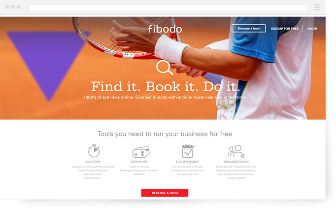
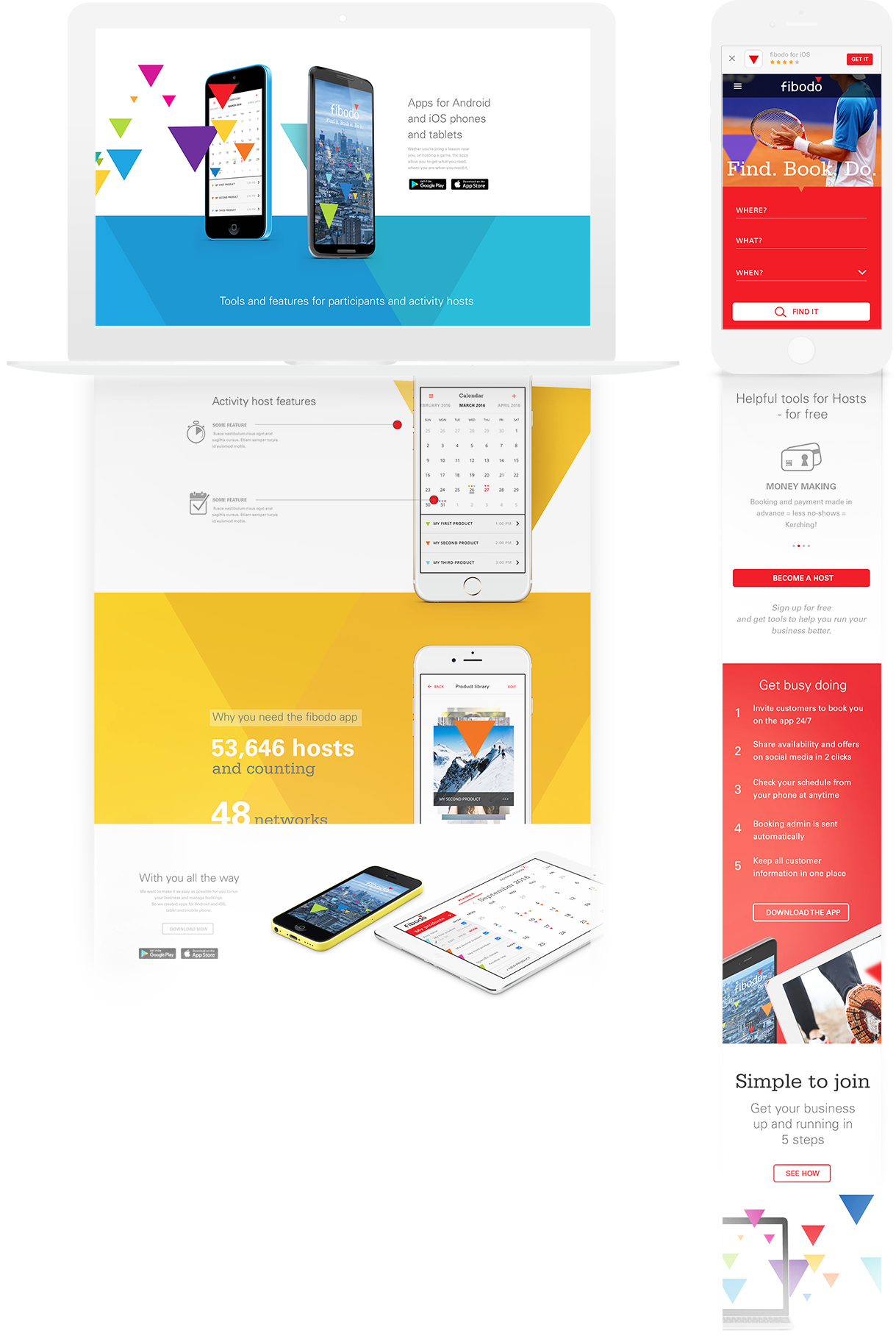
To reduce the cost per aquisition even more, fibodo needed a more inviting experience. Starting with translating the existing brand guidelines for devices, I evolved the visual direction for the brand - across email, website, apps and printed materials.
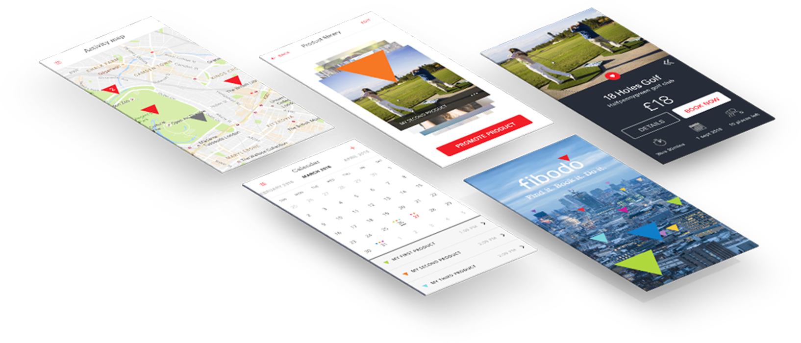
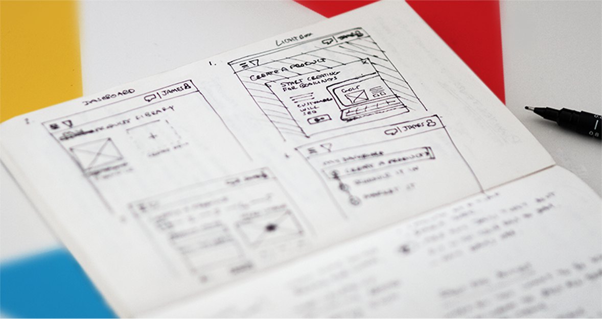
Screens for implementation and testing on different devices were thrashed out rapidly so as not to hold up developers. As fibodo is not only a booking engine, but also a suite of tools to run a business, all user flows had to be thought through for tablet and mobile devices. Users hosting activities should be able to manage bookings on the go: at the golf tee, in the bar, from the mountaintop.
Working with budget in mind, knowing what methodologies to use where and when came in handy.
Consistency is key - style tiles and visual hierarchies help developers.
Speaking to Customer Service Teams to inform design thinking and help to save their time too.
Interactive prototypes for testing with users and stakeholders can be quickly mocked up.
Getting stakeholders in a room and following a process of discovery, design, validation, and iteration before deploying.